This review contains spoilers for HELLBLADE: SENUA’S SACRIFICE’s narrative and mechanics
Immersion is a popular buzzword in gaming. It’s used to describe HORIZON ZERO DAWN’s captivating graphics and sound design. THE LAST OF US has an immersive story and characters because they are gripping and relatable. GOD OF WAR’s gameplay is immersive because you can feel it. DISHONORED’s design is immersive when you don’t see it. Though the word can apply to vastly different elements, the general consensus is that this feeling of immersion occurs when players, “genuinely feel a sense of existing in the game’s world.”
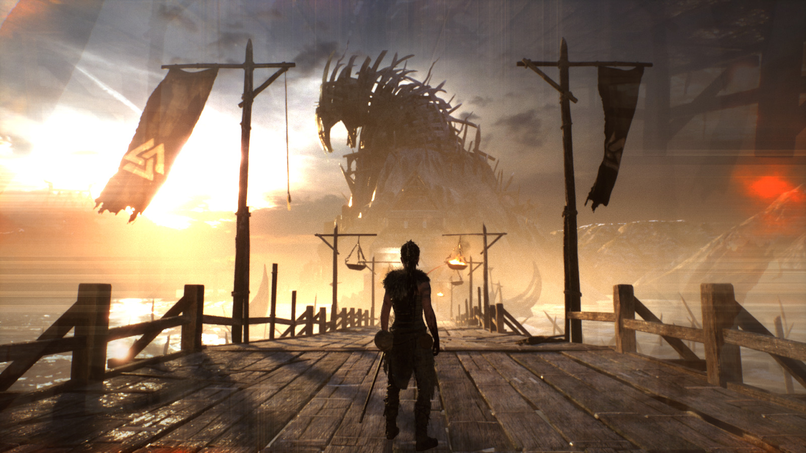
By this conventional understanding, I have rarely been more immersed in a game than when I played HELLBLADE: SENUA’S SACRIFICE. Developed by Ninja Theory and released in 2017, HELLBLADE follows the story of a female Pict warrior, Senua, in the 8th century as she journeys to a mystical land seeking a way to resurrect her deceased lover. The game received widespread acclaim on its release, with significant praise directed towards its portrayal of a protagonist struggling with psychosis, a condition that causes individuals to see visions and hear voices that aren’t consistent with reality. Ninja Theory received a grant to support this endeavor, developing the game with guidance from both professors of neuroscience and patients affected by psychosis in order to ensure the narrative was sensitive and accurate. The result was an exceptional achievement both in game design and empathy-building.
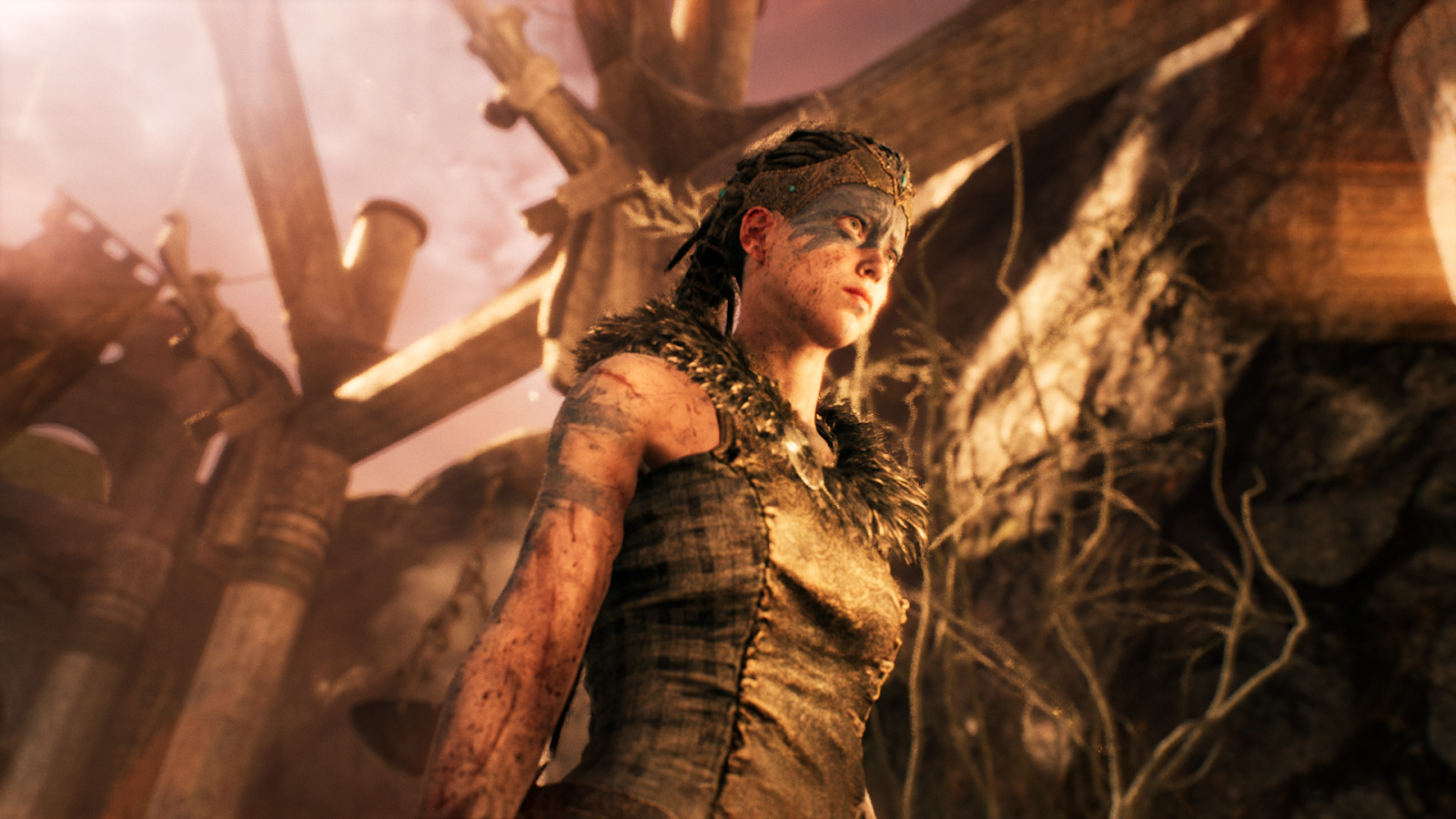
The titular character, Senua.
The game utterly seduced me into its chaotic and enigmatic world. It achieved this by eliminating as many potential barriers as possible between me and Senua herself, from tutorials to heads-up displays. However, while this effect felt like a superb achievement for a vast majority of the game, there were moments where the experiment failed, resulting in an almost violent sense of discord when the illusion was broken.
Defining some terms
In their 2015 essay “‘Blackout!’ Unpacking the Black Box of the Game Event,” researchers Steven Conway and Andrew Trevillian present a model for thinking about player involvement in games. The model describes three distinct levels that a player can occupy while taking part in a “game event”: the Social World, the Operative World, and the Character World. To summarize briefly, the Social World is the world in which we exist as our physical selves, the Operative World is where we function as participants in an activity, and the Character World exists only when the barriers between activity operation and player dissolve as much as possible. Using my example of HELLBLADE, in the Social World I exist as Evan; in the Operative World I exist as Evan-as-Senua; in the Character World I exist solely as Senua (again, in as much as a 20-something gamer can “be” an 8th century Celtic warrior).
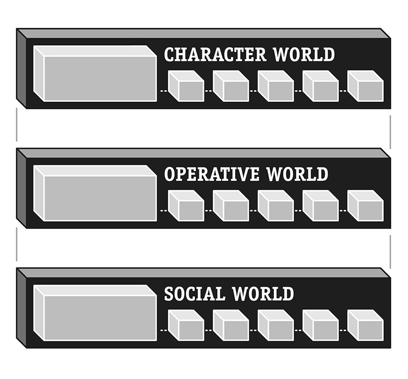
Diagram of the three “Worlds” in Conway and Trevillian’s model; image taken from “’Blackout!’ Unpacking the Black Box of the Game Event.”
Conway and Trevillian detail the mechanisms by which players navigate these three levels, careful to indicate that it is more difficult to “upkey,” Conway and Trevillian’s term for moving in the direction of the Character World, than it is to “downkey” back towards the Social World. After all, the Character World is locked off behind a wall of screens, controllers, headphones, and systems. Any slight malfunction in the hardware, glitch in the game, or instinct to check your phone can instantly downkey you towards the Social World.
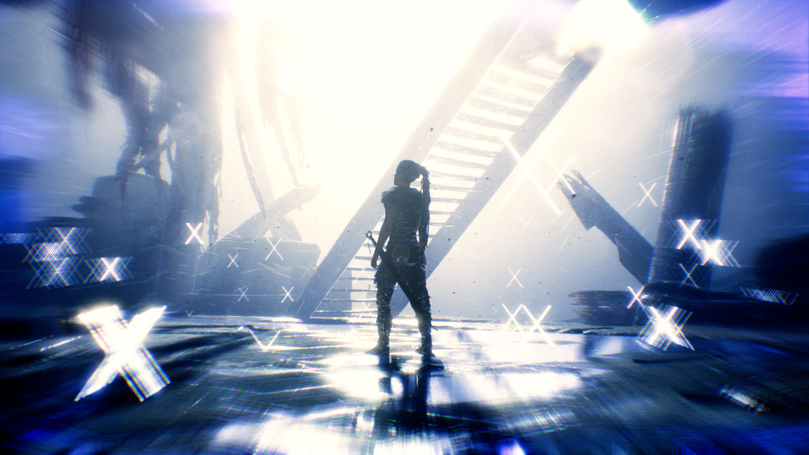
What I loved most about HELLBLADE: SENUA’S SACRIFICE was how it consistently held me within the Character World while effortlessly reinventing its gameplay mechanics without any tutorial messages reminding me that I was playing a game. I’ve played games that downplay their UI elements, and I’ve learned that whether it was THE LAST OF US, GOD OF WAR, or THE LAST GUARDIAN, some message is eventually going to pop up to explain that you need to press “X” button to climb ladders. This makes sense. Ladder climbing doesn’t have a universally agreed upon input action across games; sometimes you need to press a button, other times you can walk right into them.
So when I came to my first ladder in HELLBLADE, I waited for the tutorial. After a few moments of staring at the wall, I realized that no button prompt was going to appear. I fumbled with the buttons that were most likely to achieve the effect I desired and found it rather quickly. This moment, minor as it may be, made me realize how this game was going to communicate with me: it wasn’t going to tell me anything.
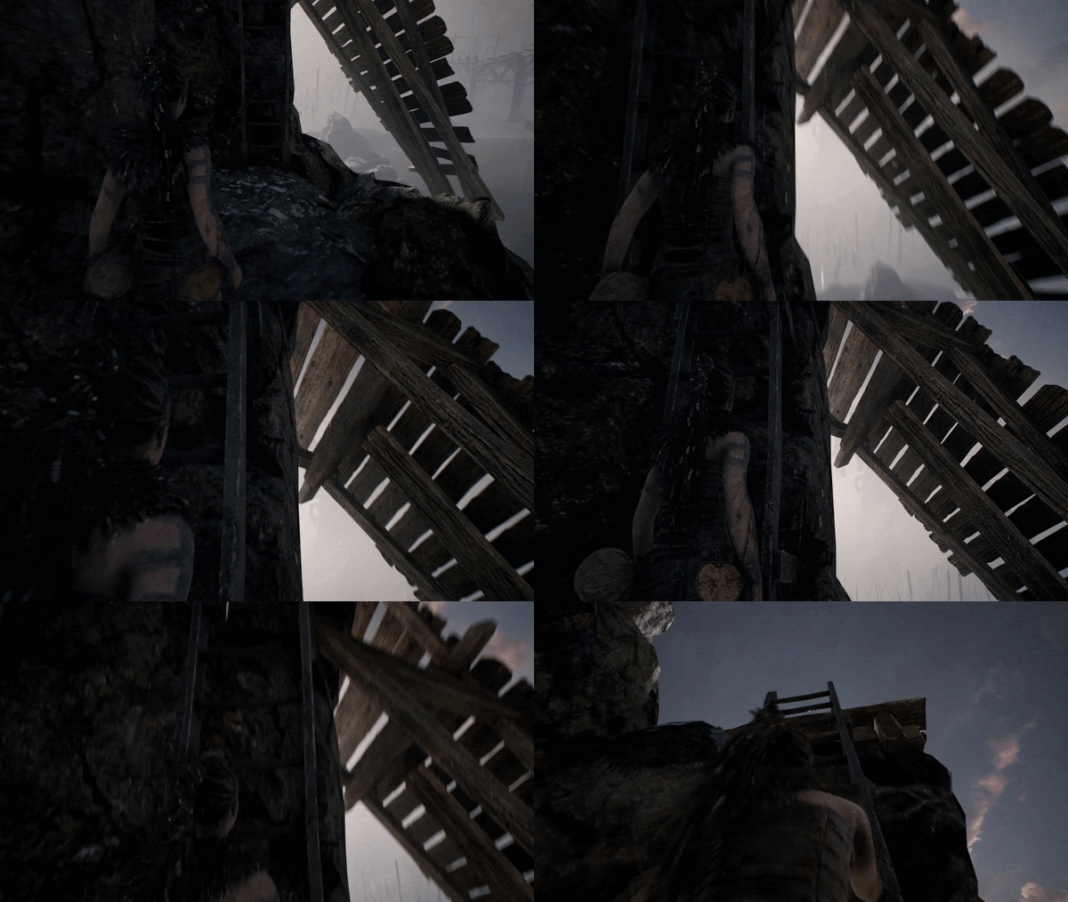
How to Ladder 101
I loved it. I loved stumbling through the first series of puzzles while I figured out what the game actually wanted me to do. I loved realizing after three hours of playing that holding the sprint button in combat unlocked a whole suite of new moves, adding the grace and fluidity that my earlier fights had been lacking. And I loved that every step forward I took in this frenetic nightmare world was one that I took myself. It connected me to Senua, making the Character World readily accessible whether I was coming back from a two-day break, or continuing a three-hour session.
In her video published to Polygon’s YouTube channel, Jenna Stoeber articulates a lot of the issues facing developers as they design UI and HUDs for players. According to Zane Lyon, a designer interviewed in Stoeber’s video, “I think the joke is that if I could make any game, the perfect UI is no UI.” Conventional wisdom holds that removing non-diegetic distractions from the player’s view, like brightly colored health bars or button prompts, is one of the primary methods of achieving the much sought-after sense of immersion described at the beginning. However, Lyon goes on to explain that, “[A HUD] is a replacement for the senses that we would normally have in real life… oftentimes the UI is meant to compensate for things that we would normally inherently know.”
It may seem obvious, but this detail is important to keep in mind, especially because the game attempts to present all of its information through some diegetic form. In GOD OF WAR, the health bar in the bottom left of the screen may occasionally be distracting, but, in a game that emphasizes combat, it is essential that players have a constant awareness of Kratos’ vitality. If you didn’t, any death might feel cheap. So while heads up displays may be distracting, they are frequently necessary to maintain the player’s trust that the game will give you the information that you need to know. This is where I ran into trouble.
Welcome to the Battle-Ax Zone
About one-third of the way through the game I (meaning Senua), walked through a door only to be pushed down by a towering enemy. The event was scripted and framed similarly to cutscenes. I assumed Senua would dodge to the side and stand up on her own, eventually moving to a neutral position where I would take over and fight the enemy myself.
That didn’t happen.
Instead, the blade of a huge battle-ax crashed into Senua’s back, crumpling her and sending me to my first death screen of the game. I was shocked and half-expected the death to be scripted, though the next thing I saw would be Senua crawling to safety and miraculously patching herself up. That feeling of shock turned to frustration when the game abruptly cut to Senua standing inside the room I had previously entered, already facing the same enemy who had just killed me.
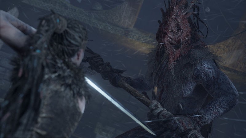
Unable to load footage of Evan’s shame.
It’s a small thing, but at that moment something in my brain snapped. I didn’t just downkey into the Operative World as I waited to be respawned. I was smashed all the way down to the Social World by a fucking battle-ax. I immediately went to YouTube to see what was supposed to happen. Turns out, after Senua was knocked down, there was a set of sound cues meant to indicate that I should press a button to dodge the incoming attack. I felt cheated. I didn’t feel that the game had properly communicated to me that the voices I heard were cues I needed to respond to. If such a circumstance had appeared in a one-off tutorial, then I wouldn’t have been as frustrated, even if I still failed to act in time.
But the thing is, after reflecting on my playthrough, I realized that I had encountered a moment like this earlier in the game, with similar sound cues, framing, and a required button press to dodge an attack. At the time I failed to realize this, so I didn’t make a move; fortunately, the enemy I was fighting failed to attack in time, so Senua regained her composure on her own and continued fighting—good news for me at the time, to be sure. The result, however, was that the next time I encountered a similar scene, I didn’t know that action was required of me.
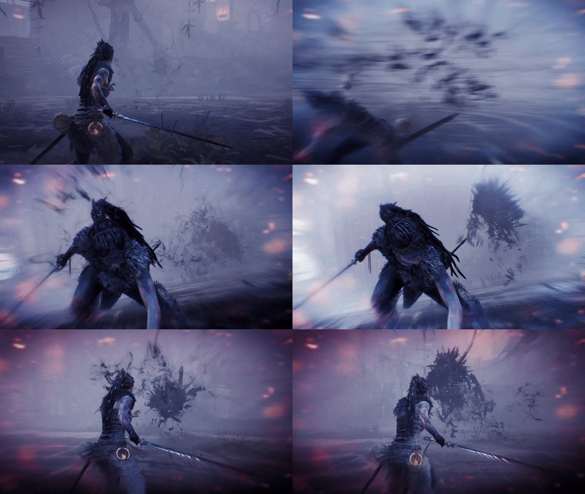
So Senua’s grisly death at the hand of a crazed, shirtless, battle-ax wielding viking was actually my fault. I hadn’t learned the lesson I was supposed to, and that feels like a fair perspective. I should have been more perceptive. I certainly could have at least button-mashed during the scene, but that awareness doesn’t change the feeling of being somehow betrayed by a world in which I had placed a great deal of trust.
Insanity for Sanity’s Sake?
The result of this moment, and a few others like it, gave rise to a sense of uncertainty about the game. In HELLBLADE, sometimes you’re supposed to “fail,” appearing to die occasionally in cutscenes—it’s why I didn’t react immediately after dying in combat the first time. Discovering that you can be in danger when you believe yourself to be safe, and that seemingly perilous moments don’t require any input at all is disorienting. It becomes more difficult to trust the game and maintain immersion in the Character World without occasionally wondering, “Do I need to be worried right now?” And, perhaps, this inability to trust a stable reality is intentional, or at least not in conflict with the game’s themes.
As I mentioned at the beginning, HELLBLADE: SENUA’S SACRIFICE is about a character who cannot trust the reality she perceives. A compelling argument could be made that the frustration arising from this moment and others like it is complementary to the narrative. This may be more of a byproduct of the story’s themes than an intentional decision from Ninja Theory, but this sort of out-of-bounds quality could augment the game’s goal of engendering empathy with the protagonist.
While it’s an intriguing perspective, it’s not one that feels consistent with my particular experience. HELLBLADE already does so much within its world to destabilize the player’s trust in reality. For me, the effect these kinds of moments had were to make the boundaries of the game space more clear, not less.
This is one of the interesting things about “immersion.” While we may conventionally understand it as the feeling of “existing in the game world,” it is a highly individualized sensation. Someone else may have different perceptions of the moments I had difficulty with and won’t be troubled by them. In fact, if I had experienced them in different contexts, I may have merely downkeyed to the Operative World and not the Social one.
In one of the game’s more mischievous moves, it breaks its diegetic UI commitment precisely one time. Near the beginning, after confronting her first combat encounter, Senua is infected with the Dark Rot, a plague that will spread every time she “dies.” The game proceeds to present non-diegetic text that speaks directly to the player, stating, “The Dark Rot will grow each time you fail. If the rot reaches Senua’s head, her quest is over. And all progress will be lost.” The catch is that this statement, the only time the game speaks directly to you, the player, is actually a bluff.
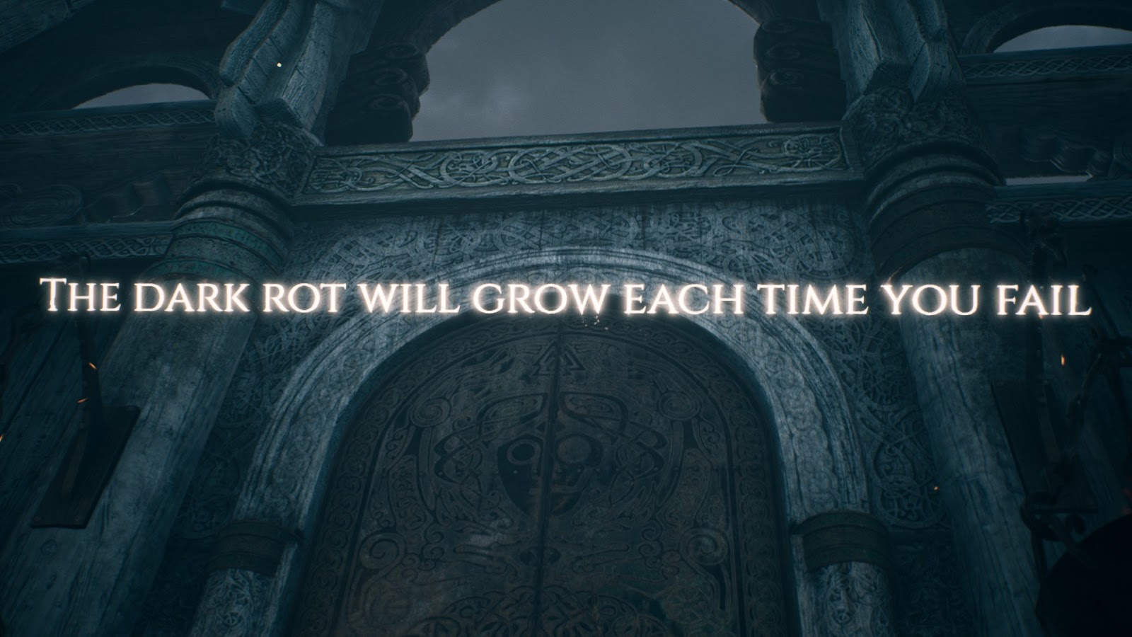
There is no permadeath mechanic in HELLBLADE. Many players have tried to trigger this permanent loss of progress, but, even after 50 deaths, the Dark Rot simply won’t reach Senua’s head. The message exists entirely to make players afraid of the possibility of true death, even if that danger isn’t a reality. I didn’t know this when I played the game so I bought into that fear. This framing could explain why some of the deaths I experienced frustrated me so much. From my perspective, they had the potential to cost me more than a few minutes of progress and my personal pride. If I had gone into the game knowing that the permadeath mechanic was a bluff, I might not have been bothered by them in the same way.
The states of immersion into which we enter don’t always occur within the bounds of a game. Immersion is also influenced by prior knowledge, comfortability with control schemes, personal tastes, whether your phone is turned on, how long you’ve been playing, etc., etc., etc. So many factors contribute to its success or failure. I may view HELLBLADE’s inscrutability as an evocative experiment that succeeds even as it frustrates, but others may find meaning within the frustration itself. After reflecting on why the game was so successful at immersing me into its world, as well as why it sometimes troubled me, I now think the goal of designing for immersion shouldn’t be to disguise a game’s artificiality, but to convey that artificiality in an intuitive manner. For me, that doesn’t always correlate with the extreme subtleties that Ninja Theory employed.
Downkey to Upkey
I’m not describing my experience with HELLBLADE: SENUA’S SACRIFICE to advocate for tutorials and informative HUDs, or to criticize Ninja Theory. Like I said at the beginning, my favorite thing about the experience was how it made me connect to Senua, and a big part of that was how it held information back from me. While I may have spent a significant amount of my time immersed in the Character World of the game, I don’t think it’s possible to maintain that connection at all times. Even as we project ourselves into fictional characters, we still have a body and consciousness that exist in the Social World.
Perhaps the goal of immersion, then, shouldn’t be complete and total. Game design uses the processes of downkeying and upkeying intentionally, like downshifting and upshifting while driving a car. You downkey into the Operative World when you need to learn something, and upkey to the Character World once the lesson is learned. One process is not superior to the other because they are both necessary for an intuitive experience. All games must do this, even if they lack button prompt messages. After all, discovering how to navigate the ladder at the beginning of HELLBLADE presented a moment of friction that downkeyed me into the Operative World where I had to think about the controller in my hand and the different forms of vocabulary that I could use to navigate the obstacle.
This is why I find Conway and Trevillian’s model useful. Rather than thinking about immersion as a binary state that either exists or doesn’t, we can observe it as a fluid process with varying degrees, one that can be influenced but never fully controlled. Immersive design isn’t actually design that you don’t see. It’s design that facilitates accessibility between alternate realities. Sometimes that does mean eliminating all UI onscreen, and sometimes that may mean reminding the player that they’re playing a game, and they should press the “dodge” button to avoid a giant battle-ax.







Comments