Anyone who’s been in a room with me longer than a couple minutes will know this, but for the uninitiated, here’s something about me: I’m a big ol’ fat Disney nerd. I grew up on the films and TV shows. I waited eagerly every summer for my annual childhood trip to Disneyland. I was an Annual Passholder all through high school, worked at the parks in college, and currently work in animation. Disney’s brand has been a constant presence in my life, and a constant fascination of mine. If anybody’s the ideal audience for Disney’s effort to capitalize on nostalgia through live action remakes, it’s me. I’m a focus group of one.
And OHHHHHHHHHH how I hate them.
I remember being a disaffected goth teen leaving the theater after Tim Burton’s ALICE IN WONDERLAND thinking “Yeah—that was fine!” I half-watched MALEFICENT on TV at my dad’s house, which is about all the attention it deserves. I was the only one of my friends who didn’t go completely bonkers over Favreau’s THE JUNGLE BOOK. BEAUTY AND THE BEAST I didn’t even bother with. The only one of these things I’ve actually kinda liked was Kenneth Branagh’s CINDERELLA—because, c’mon, Kenneth Branagh and CINDERELLA—and it’s the most unilaterally forgotten in discussions on this topic. Fans of TRAILER TRASHED have been privy to my drunken rants about the upcoming DUMBO and ALADDIN remakes, which you can probably piece together based on this paragraph.
In order to write for Merry-Go-Round Magazine I have to nurture a bit of a contrarian streak, and maybe that’s where my eye-rolling comes into play on the previous Disney live-action remakes. It’s fun to hate popular things for being popular, and admittedly, most of the films I mentioned above aren’t bad per se—they just range from “fine!” to “meh.” It wasn’t until the latest trailer dropped for THE LION KING that I could clearly articulate my exact issue with this trend. It’s gonna be a wild wacky cartoon rant wrapped up in an animation crash course and topped with a dollop of Disney’s history and founding philosophies. Buckle up.
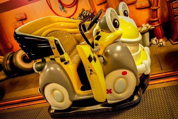
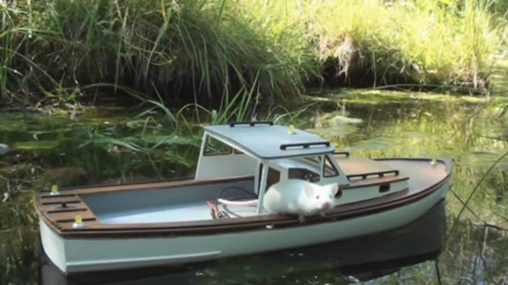
She gets great mileage but the engine is just a single hamster running really fast on a wheel
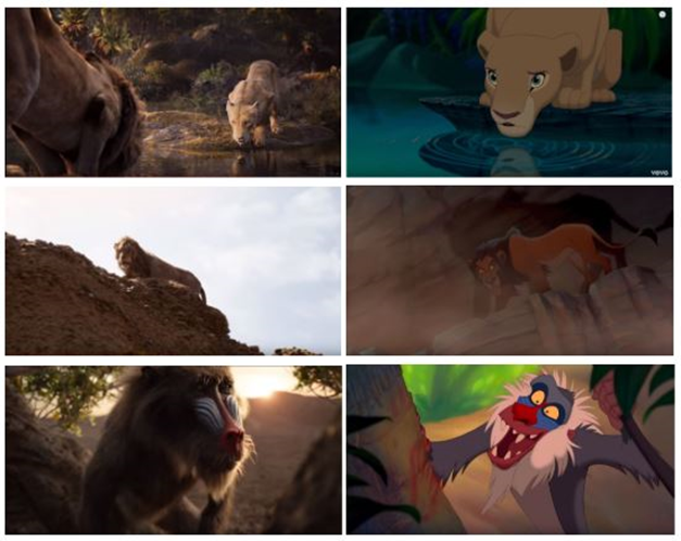
Here is the LION KING trailer released on April 10th (clocking in at 24.8 million views as of this publishing). It features two of the most iconic speeches from the 1994 original: Scar’s introductory monologue (“Life’s not fair, is it?”) and Mufasa’s explanation of the Circle of Life to the young Simba. It also features stunning CGI renderings of some of the most recognizable images from the original: young Simba’s tiny pawprint in the imprint of his father’s; the stampede of wildebeest; Simba growing up walking across the log with Timon and Pumbaa; needless to say, the gang’s all here. And while they are not all complete, exact, shot-for-shot remakes… they’re pretty damn close.
There is one major difference. Here are some side-by-side comparisons. See if you can spot it.
Let’s talk about cartoons.
Have you ever gotten bored in class and doodled on the corners of your textbook pages, then flipped through to create little films? Maybe a flower growing, or a car going over a ramp, or stick figures dying in increasingly gruesome ways. Congratulations! You’re an animator. Live action filmmakers are intimately familiar with “frame rate”—the number of pictures per second taken by a camera, then strung together and played at just the right speed to create the illusion of movement. (Shout out to Eadweard Muybridge!) Animation works exactly the same way, except instead of capturing real life images with a camera, artists create every image from scratch. Most live action films are viewed at 24 frames per second, or 24 images clicking by every second. Most animation is shot “on twos,” meaning there’s one drawing for every two frames—so roughly 12 images per one second of animation.
CGI and VFX function essentially the same way—whether you’re rotoscoping out a moustache, integrating a fully computer-generated tiger seamlessly into a real world environment, or creating immersive, computer-generated worlds. They all follow the same basic principles of animation, just how all filmmaking follows the same principles of frame rate, which is all built around tricking our brains into seeing moving images instead of still pictures. This is essentially what people mean when they say that animation is a medium, not a genre.
So, take THE LION KING (1994). Its runtime is an hour-and-29 minutes—or 5,340 seconds. Multiply that by 12? That’s 64,080 individual images encompassing characters, props, backgrounds, lighting, and everything in between (including the inbetweens—that’s a little animation humor for you). Whether you’re drawing everything by hand or using models on a computer, that’s a ton of work—but it pays off by giving creators the ultimate control over every single facet of their films. Every color, every movement, every blade of grass or bead of sweat or flick of an eyebrow… it’s all painstakingly accounted for, and amounts to a level of extreme detail and nuance frankly not possible in live action filmmaking.
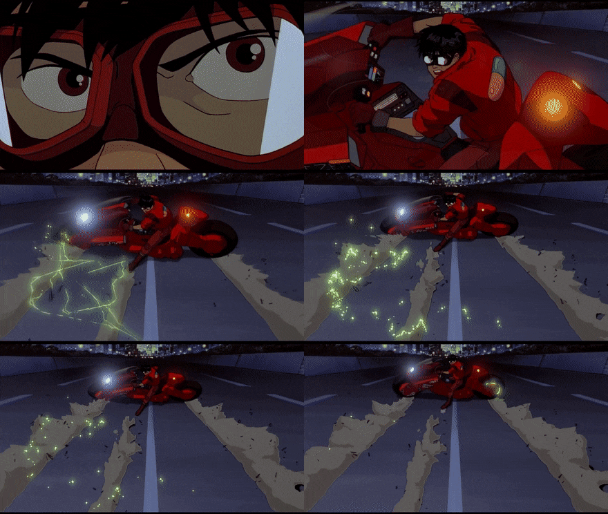
I cannot watch AKIRA because the amount of time and effort required to animate this film by hand makes me sick to my stomach to think about. But totally watch it. It’s amazing.
So, what do animators do with all that control? For the purposes of this article/argument, let’s examine character design and character animation.
In live action terms, character design is the animators’ casting, makeup, and costume departments. Good character design in animation tells you almost everything you need to know about a character just by looking at them, or upends these expectations to add surprise or conflict. Here’s one of my favorite character designs in recent memory:
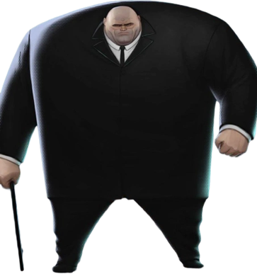
This is Kingpin—the main villain in Sony’s smash animated hit, SPIDER-MAN: INTO THE SPIDER-VERSE. The first thing you notice about this character is he’s fucking huge. He’s so big, he’s even clipping just slightly out of this frame. But he’s not a big fat guy—no. His frame is very square—you can almost draw a perfect square from his hips and his shoulders. His hands are enormous, but his feet and legs are small and quick. He’s strong. He’s jacked. He’s sturdy. He’s coming to mess you up. The second thing you notice is his head—in many ways, the focal point of this design. Kingpin isn’t just strong, he’s smart. At the center of this absolute tank of strength is a powerful brain that can do battle just as well as his other less-squishy muscles can. The third thing you notice is what he’s holding: a cane. The suggestion of an injury, but not necessarily of weakness. This wall of strength is not impenetrable—something happened, whether it was an accident, a war wound, or a hint at an emotional vulnerability or shortcoming.
Here’s another example with a lot of the same elements, but used to very different effect:
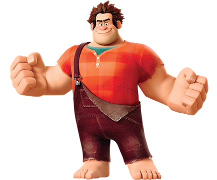
This is Ralph of Disney’s WRECK-IT-RALPH. He’s a villain in the context of the video game in which he… well, wrecks things—but deep down inside he’s got a soft heart and wants to be a good guy. As we learned, “just because you’re a bad guy doesn’t mean you’re a bad guy.” We see elements of both reflected in his character design. For one, he’s got the same broad square frame as Kingpin—you can see that near perfect rectangle in almost the same places, and reinforced by the square pattern on his shirt. He’s also got massive, powerful hands and big ol’ feet perfect for stomping around. But while he’s definitely strong, he’s not imposing the way Kingpin is. He’s decked out in bright warm colors. He’s got cute lil rosy cheeks and a big pink tomato nose. His hair’s all askew in a way that makes you kinda wanna ruffle it. His overalls are missing a strap—pointing to the fact that he’s taken a hit in the same way Kingpin’s cane does, but with Ralph it makes him seem more like a goof. This is a guy who’s gonna maybe drop an anvil on you, but not someone who’s going to hold your family hostage.
Character animation is the visual performance created by artists to complement the voice actor’s work. How a character looks is one thing, but how they move, act, and emote is what truly brings them to life. For example, what if I took ol’ Kingpin up there and made him walk around on his tiny tippy toes like a little fairy? That’s a totally different characterization.
I will now shamelessly steal the brilliant work of Lindsay Ellis and provide an example from BEAUTY AND THE BEAST. I use this not just because she is my queen and I want to be her when I grow up, but because this is exactly the kind of incredible animation that earned BEAUTY AND THE BEAST the first-ever Oscar nomination for Best Picture for an animated film:
We see The Beast process his outburst in real time at the end of this clip—from blind rage, to shock, to shame and regret. He knows he failed. He lost his temper. And we know all of that without a single line of dialogue. As Ellis points out, this single shot is one of the crowning achievements in all character animation—ever.
But I’m not a (total) hack, so here’s another example I love. And if you thought you’d get through a thinkpiece about animation from me without a little BAMBI, you were sorely mistaken. This is a lowish-quality Finnish dub because I watched the good YouTube one too many times and it got DMCA’d but it still gets the point across, and as I always say, 360p BAMBI is better than no BAMBI:
I could honestly go on for an hour about just this scene—and much of what’s going on here is accomplished through color and sound design in addition to the character animation—but I will TRY to reign in my BAMBI love because we’ve got a point to get to. (Yes—I am still building to a point.)
I love this scene in particular because you can plainly see the contrast between Bambi, the stag herd, and the Great Prince of the Forest. Bambi toddles around; he tries to mimic the older stags, but isn’t quite there yet. We see his curiosity when he approaches the oncoming herd, his fear when he cowers under the log, and a mixture of both when the Great Prince approaches. The stags themselves are uniform—they all look to be the same character model. They are a unit of power and maturity, and they’re intimidating by virtue of their uniformity, like soldiers. But even these powerful stags are no match for The Great Prince. He is defined by a regal stillness in a sea of color and noise. His chest is out, he glides gracefully across the meadow. You have no idea who he is, what his name is, or what he’s about—but you know he’s in charge. In a film like BAMBI where the adult animal subjects are just about as realistic as you can get, these subtle nuances of animation make all the difference.
So. You’re an expert in character design. You’re a pro when it comes to character animation.
Tell me literally anything about this character:
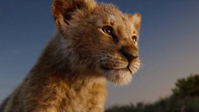
Ok… This is a baby lion. Um… In this particular frame he’s kinda looking up and he’s lit from underneath so… hopeful baby lion?
Again—what’s the big difference between these images?

Not to get too dramatic, but how do you not look at these and just feel heartbroken? They’re completely lacking in all of the depth brought to play by the original film’s character designs. There’s no personality showcased in the way these characters move. And all of this is with the knowledge that these are still animated characters. This ain’t HOMEWARD BOUND. They didn’t follow a bunch of bonobos around in the sahara for eight weeks and then have Beyonce dub over the footage.
Even if these are computer-generated characters imposed on real environments (which I don’t think they are), it’s still undeniably animated—but worse in every conceivable way except that it looks more lifelike. Which is not the point of animation. If it was the point of animation to look more lifelike, all of those amazing character designs and animated moments would be moot. Holy shit—if you saw someone walking down the street who looked like Kingpin, you’d take them to the hospital. The point is to tell great stories with great characters using the unique tools that the animated medium provides. And I know we’re only talking about a trailer here, but so far, this is something that THE LION KING (2019) utterly fails to accomplish. Unless there are some really, really big surprises in store, this is essentially THE LION KING (1994), but more expensive and worse.
I’m not the first person to make this point, nor am I the only person to make this point. But what really grinds me up about this trailer in particular is the apparent motivation for creating these remakes in the first place. This trailer borrows so much from the original—the sweeping score, the dialogue, the images themselves, even one of the original voice actors. The only reason to make this thing again would be to improve it somehow, right? Isn’t that the virtue of a remake? But how? The only things that seem to really be different are the voice cast and the animation—and while the voice cast is certainly nothing to sneeze at, the big implication behind the inclusion of the shot-for-shot images in the trailer is this: it’s the classic you remember, but better.
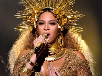
I’m putting it in writing now—Beyonce will show up, sing “Shadowland,” and peace out
Let us not forget the humble beginnings of Walt Disney Animation Studios—a humility instilled through one of the company’s most well-known mottos: “It was all started by a mouse.” Walt mortgaged his frickin’ house to get SNOW WHITE AND THE SEVEN DWARFS off the ground. It was playfully known as “Disney’s Folly” among industry peers. It became a smash hit. And… that was about it until DUMBO rolled around, the first Disney animated film since SNOW WHITE to turn a profit, and mostly because it was done as cheaply as possible to account for the fact that they lost almost all of their workforce in a strike. It’s tough to reconcile the image of a small, independent animation studio constantly facing bankruptcy with the multimedia conglomerate we know today. But that rough start, that willingness to gamble on animation as a medium, and the heart for innovation that pushed them over the top is what made Disney what it is today.
So why—for the love of god why—is Disney going forward with this bizarre push where it retcons all of the material that made it great? (Yes, I know, it’s money. This is a philosophical “why.”) The implication that live action is somehow superior to animation is directly in contrast to everything Disney as a company was founded on. It’s not even like Disney is erasing its embarrassing baby pictures! THE LION KING, ALADDIN, THE JUNGLE BOOK, BEAUTY AND THE BEAST… these are lauded as seminal animated classics that rocketed the medium to the popularity it enjoys today for both children and adults. On top of that, these are fantastical stories that thrive in the animated medium. Why, oh, why are we trying to force these organically animated stories into uncanny valley-shaped holes?
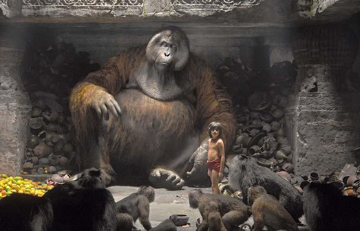
How soon we have forgotten Christopher Walken as a giant singing orangutan
Disney purists love to agonize over “what Walt would have wanted.” This is largely a useless exercise. Walt is the very definition of a problematic fave and he’s been dead for a while, but it’s tough not to think about when the company bears his name. Personally, in contrast to everything I just said, I think Walt would be a big fan of the live action remake. Walt had a passion for technology (just look at the original concept of EPCOT) and loved to push the envelope when it came to technological advances in storytelling, from the multiplane camera in THE OLD MILL to integrating traditional animation with live action footage in MARY POPPINS and THE WONDERFUL WORLD OF DISNEY. Walt also felt passionately about bringing what he designated as high art to the widest audience possible, which drove the production of FANTASIA despite naysayers and empty bank accounts. In a lot of ways, this does kind of feel like what the live action remakes are trying to accomplish—but I don’t think that’s quite right. I think Walt would have also loved INTO THE SPIDER-VERSE for its technological innovations and mature storytelling. He would have loved the simplicity and elegance of THE RED TURTLE. He loved animation. In all its forms. And he wouldn’t have pretended that THE LION KING (2019) was some kind of improvement on the original.
STEAMBOAT WILLIE Coming Summer 2025 to Disney+
The first thing that came to mind when I watched the trailer was a scene from the original LION KING—albeit, one not featured in the trailer. Mufasa appears in the stars to tell Simba the hardest thing he’s ever had to hear: “You have forgotten who you are.” Let Disney take the advice of their own films and remember where it all began. Let them be brave, take risks, and challenge the competition and themselves the way they used to. That’s where innovation is bred. That’s where true success and immortality lie.
Or, y’know. Maybe I shouldn’t spend so much time waxing poetic about dead producers and multimedia conglomerates and just watch ding dang cartoons.
Maybe.





[…] which is fairly appropriate for a children’s film (this is, however, its own can of worms that Kate Brogden fantastically opened over a month ago). The 2019 LION KING, however, is founded on the conception that if the film can truly occupy the […]