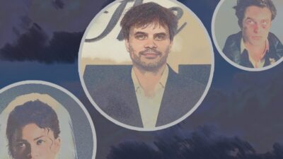
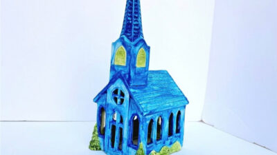
The Funko-spawned firings of Rob Jones, Eric Garza, and Mitch Putnam—in addition to more than half of total staff—signals the ostensible death of Austin-based collectibles company, Mondo, as we knew it. Whatever comes next certainly will not flourish with the same lifeblood as the company had for nearly 20 years. If you didn’t know what Mondo was, just move along—have a nice day, you don’t need to be here, believe me, you don’t want to know how much we invested in this shit. But if you have a Mondo hanging up in your living room as a proud centerpiece, then by all means, let’s take a triumphant waltz down memory lane.
Yes, yes, let’s get the obviously bad out of the way. If you thought the resale market was bad before, just you wait now that the value of these posters has skyrocketed. Maybe none of this would’ve happened if a majority of prints were timed exclusives that allowed anyone to peacefully treat themselves to a pricey poster for their favorite movie, but also maybe Mondo would have never become the name-in-spotlights “MONDO” without the blink-and-you-miss-it sales windows that rendered these screenprints as mythic treasures amongst bearded men who wear black graphic tees. The vinyl records and $150 action figures made exponentially more money than the posters ever did, yes, and Funko’s indebted success to never having to secure likeness rights for their Pops should’ve indicated to us months ago that Mondo Posters were dead in the water the moment the acquisition took place. Though the boutique screenprinting industry has flourished in large part because of Mondo’s prestigious rule, there’s still a glut of artists that have been fucked out of not just a steady gig with professional confidantes, but fucked out of the opportunity to flex their fullest personal expressionism when assigned these coveted IPs.
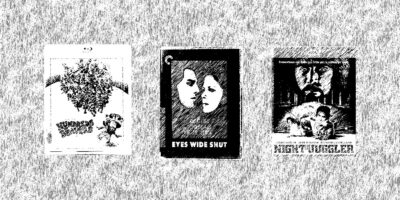
I don’t want to overthink this: I loved Mondo posters because they looked really cool. I never went to MondoCon, didn’t chat on forums, never traded, and made no new friends from being a Mondo fan, and I would still qualify my time as a customer as entirely fulfilling. That said, I’m thankful for the affable marketplaces on Facebook where I PayPal’d a newly married Alabama couple $93 for a Deathburger ROBOCOP, the Beyond Fest screening of NIGHT OF THE LIVING DEAD where I dragged myself to the Egyptian on a Wednesday afternoon to grab the black-and-white variant of Gary Pullin’s incredible 18×24, and the next year’s Beyond Fest where I grabbed Timothy Pittides’ THE EXORCIST and Johnny Dombrowski’s SHAUN OF THE DEAD in one fell swoop, plus I got to tell a proper horrified Spencer Hickman that I sleep beneath a framed copy of Jock’s CANNIBAL HOLOCAUST. Spencer, if you ever get around to reading this, know that I’ve since swapped it out for a brilliant Cameron Stewart SPRING BREAKERS that I was able to grab at retail during a Flat File Sale. Okay, maybe I was more than a little knee deep in the Mondo fandom—and the value these screenprints brought to movies I’d already loved with my entire soul—than I thought. Say what you will about Alamo Drafthouse, but what a unique delight for a theater chain to care about cinema so much that you’d be greeted in the lobby with in-house gallery prints of old favorites.
In no order whatsoever, here are some pieces commissioned by the old guard of Mondo that motivated me to spend nearly thousands of dollars on pieces of paper nailed to my walls. Whatever they put in the water sure worked on me, holy shit.
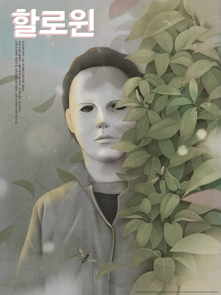
Artist: Jiwoon Pak
I know I prefaced this all by saying I wasn’t ranking any of these, but let’s just get the best Mondo poster ever made out of the way first. What is John Carpenter’s HALLOWEEN if not the berserk sexual liberation of the curious American boy, doomed to penetrate in response to intimacy out of grasp? The stoic voyeur mechanically obliterating virile, pantsless teen braids deemed unobtainable by the evil possessing him. Jiwoon Pak encapsulates the totality of Carpenter’s masterpiece while imbuing a trenchant, ethereal analysis of its most perverse themes and recontextualizing Michael Myers as the subject of a Korean glamor shoot. It’s communicating with preexisting art through the creation of new art, it’s an instrumentalist reading of a 1978 slasher that doubles as an emotionalist provocation, this is cooking with motherfucking gas. This was my holy grail, and it’s my proudest possession bearing the Mondo insignia.
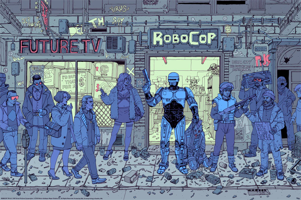
Artist: Josan ‘Deathburger’ Gonzalez
Recently commissioned for the steelbook variants of CD Projekt Red’s CYBERPUNK 2077, Deathburger’s multi-shaded, monochromatic visions of impending urban desolation were fatefully paired with one of the formative aesthetic texts on technofascism in this stunning ROBOCOP collab. As is apparent throughout this list, I am a slut for overcrowded and overdetailed pieces, and the way Deathburger is able to elicit the maniacally violent ennui of the 1987 cult classic without resorting to the usual collage of ROBOCOP iconography is impressive: the toxic sludge victim seeping out of a doorway is too cute, but the mini drama amongst the crowd of competing reactions to the authoritarian Robocop—shock, inundated disgust, apathy, arousal—leading way to more chances to snatch a dollar from your pocket would make Verhoeven proud.
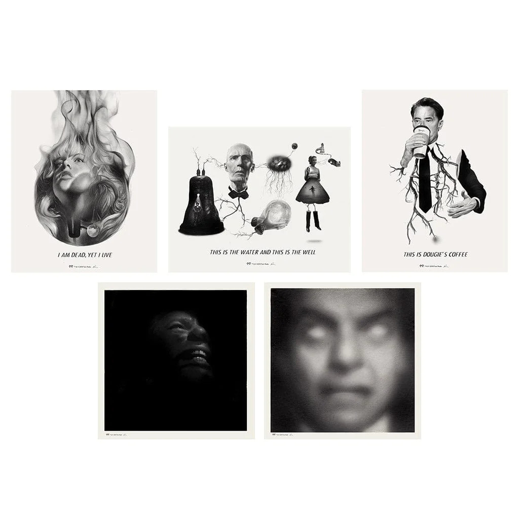
Artist: Greg Ruth
Greg Ruth’s TWIN PEAKS series, a multiple-wave run of illustrations that elicits the je ne sais quoi of Frost and Lynch’s PNW odyssey into the ultimate war between angels and demons better than some episodes of TWIN PEAKS, is one of the most underrated Mondo projects of all time. The out-of-focus close-up on Leland Palmer’s possessed face is an arresting pivot of my home, even at its measly 8×8 size.I’d be head over heels for these inky icons had I just ordered them off the site, but these hold a special place in my heart for being purchased during the first, and sadly only, time I visited Mondo’s Austin gallery for an in-person opening. In 2019, I was lucky enough to be covering South by Southwest, and even luckier than Mondo coincided their Ruth opening that same week. I walked in with the wide-eyed splendor of seeing Willy Wonka’s factory (read: a modest space with wall-to-wall art) and walked out with a signed Series 4 set of TWIN PEAKS prints and $80 yanked from my wallet. All in a day’s work.
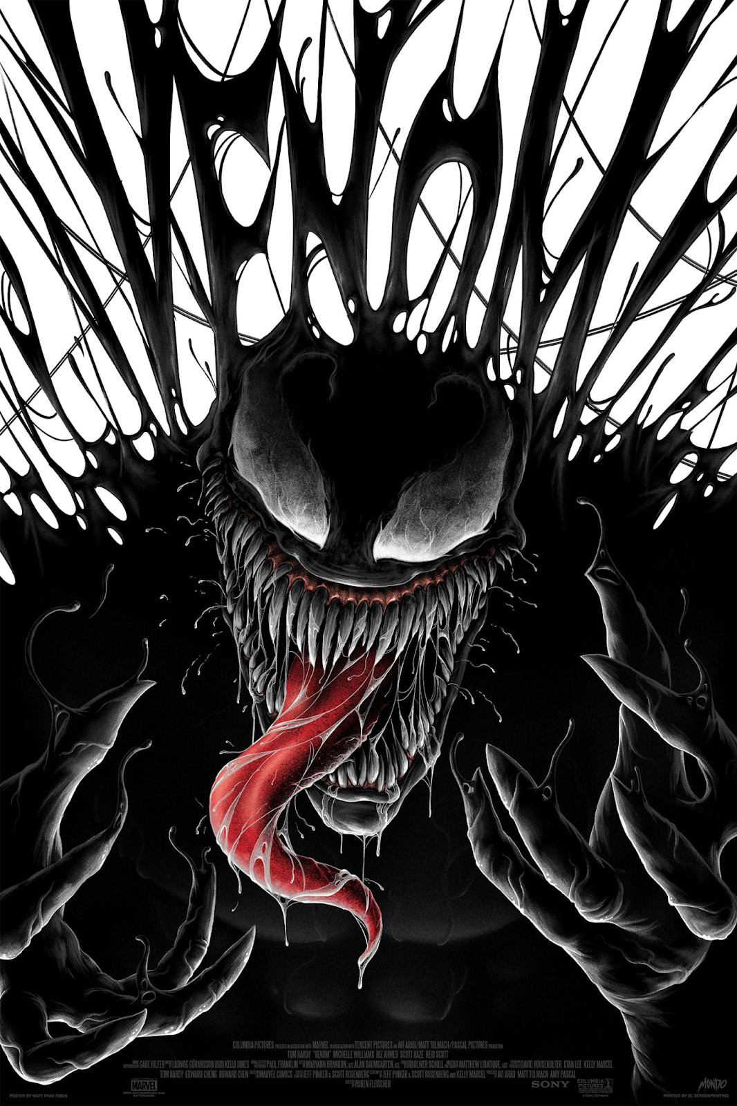
Artist: Matt Ryan Tobin
It’s such a bummer that the Tom Hardy VENOM movies are such runny, spoilt dogshit bores, because Matt Ryan Tobin’s spectacularly contrasty promotional tie-in is the best roll-up poster never sold in the corner of a Toys”R”Us.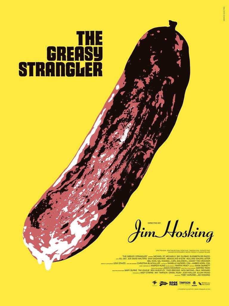
Artist: Alan Hynes
The Warhol allusion is a ballsy, “Babe Ruth pointing to the stands” decision that, like much of the marketed posturing leading up to its limited release, turned off more people to THE GREASY STRANGLER than any of the actual contents within THE GREASY STRANGLER, but as one of the devoted fans of this undersung Sundance favorite, I believe the callback to be not just appropriate, but apt. This has been the poster hung by my home office desk the longest, it manages to both brighten my mood and urge me to immediately look away and back at my laptop. I’ve gained some, let’s say, muscle mass since 2016, so it’ll be a minute before I’m able to fit into my large “HOOTIE TOOTIE DISCO CUTIE !!!” shirt again, but it’s still in my closet waiting for the day.
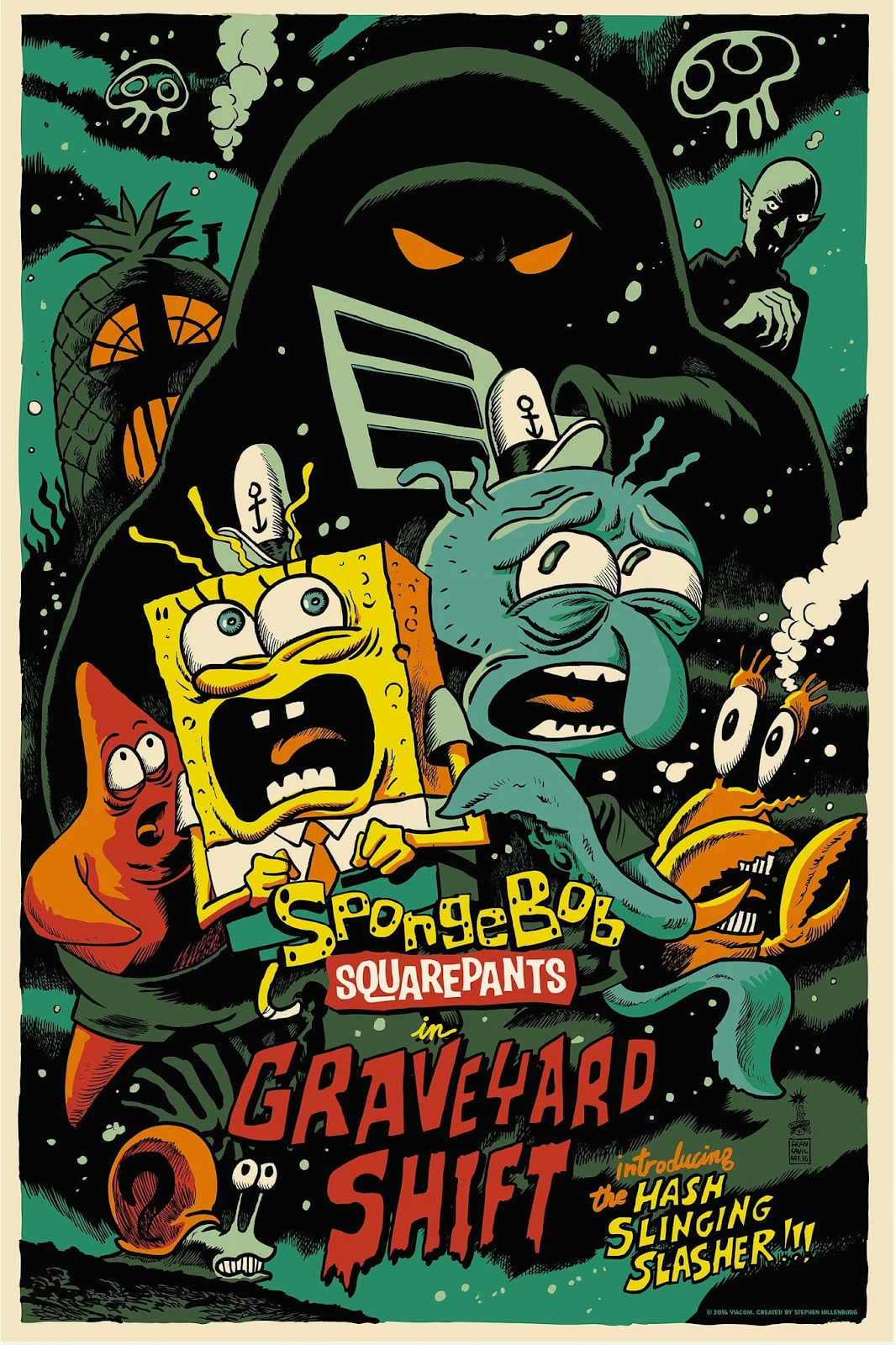
SPONGEBOB SQUAREPANTS IN “GRAVEYARD SHIFT”
Artist: Francesco Francavilla
This moody Nickelodeon collaboration by one of my favorite artists, the great Francesco Francavilla, here celebrating a top five SPONGEBOB SQUAREPANTS episode, both manages to make me laugh every time I look up at my print of it (the further out from the center you get, the characters are so scared that they’ve lost the willpower to resemble themselves) and pushes me to consider episodic media on a higher pedestal than I’m adjusted to: “Spongebob Squarepants in ‘Graveyard Shift’” is one of the few Mondo posters for a television show, and, even rarer, dedicated to a single episode. Bad shows can still have great episodes, all-timers can have one banger episode after another that we should start evaluating individually for maximum appreciation, and maybe it’s high time we treat “The Impossible Dream” from FRASIER the same way we regard APOCALYPSE NOW. I don’t know! These are three ideas I got just from looking into SpongeBob and Squidward’s curly eyebrows again.
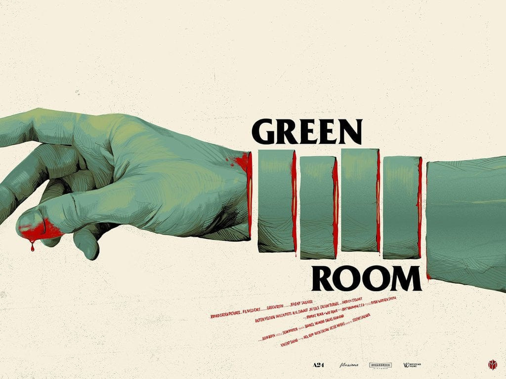
Artist: Oliver Barrett
When Oliver Barrett eureka’d the idea to turn Anton Yelchin’s mangled, machete’d arm into the Black Flag logo, you just know that overhead light bulb felt like Times Square short circuiting into an apocalyptic burst of sparks. An incredible concept with an even better execution that makes me want to consider a movie I don’t even care for all that much as an all time favorite. When Mondo was at the height of its powers, their work would help you find new favorite movies just by virtue of wanting to fully appreciate their posters. The ever savvy A24 knew it was in their best interest to license a majority of its 2010s slate for limited run wall art, and, before they sold genre-scented candles, their Mondo collaborations were essential in fortifying the brand as a hyper-curated powerhouse that understood modern fandoms as well as it did Bergman.
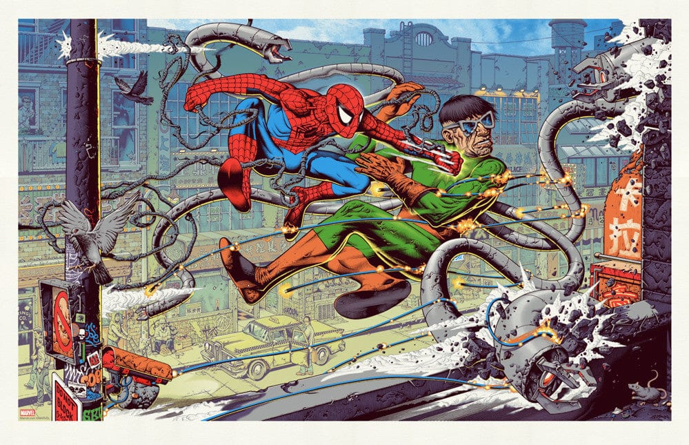
Artist: Mike Sutfin
Sutfin’s detailing manages to engulf me into the fullness of his storytelling even in moments where I really shouldn’t be taking 10 minutes out of the day to study the pedestrians’ reactions to Spidey landing a haymaker on Doc’s jaw: it’s a dangerous poster to keep above my work desk, but it’s a wondrously ornate panorama of “just another day in Stan Lee’s America” that would manage to draw my eye even if you cut out the central clash altogether.
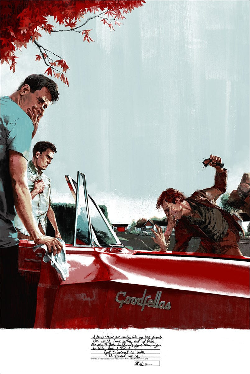
Artist: Marc Aspinall
In one of Mondo’s most formally experimental (and subsequently polarizing) commissions, Marc Aspinall centers on the most forgettable memorable scene from GOODFELLAS, wherein Henry’s vicious pistol whipping of the neighborhood mamaluke inevitably turns on Karen beyond even her own belief. Cleverly spotlighting Bracco’s second hand of a two-hander that is often mistaken for Liotta and Pesci’s, Aspinall draws the eye to much of what would attract Karen to a made man; the lapsing brush strokes in the negative space of the light blue sky, like a decaying backlot facade that manages to pique the observer as much as it morally deadens such carnage before them. Karen has never wanted to fuck Henry more than right now—the poor shmuck’s devastated friend might just barf on the convertible he just polished. And as indicative as it is of GOODFELLAS’ complementing double-headed narration, it doesn’t make me think of GOODFELLAS very much. GOODFELLAS might actually be the last thing I think about when I study the piece, frankly, and this is where the tricky tightrope of film posters existing first and foremost as promotional materials versus Mondo’s valiant curation and creative freedom starts invading how I view Aspinall’s work itself. I’m still not sure if I actually like this piece very much or at all! Art, folks!
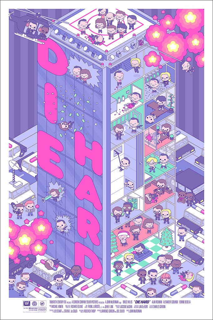
Artist: 100% Soft
Before 100% Soft signed a Disney contract and were subsequently locked in a cartoonist enclosure where they create three character emoji keyboards per week lest they be publicly drawn and quartered, they rampaged with a sensational kewpie-infested run of classic properties. I can take or leave the homogeneity of the character designs, but it’s the 3D chessboard plot summaries that charm my fucking socks off. My grandmother would take me to Peter Piper Pizza on occasion, maybe because it was slightly more affordable than Chuck-E-Cheese, or maybe it was due to the joy she found in exposing me to the fullest of my surroundings, but I fondly remember sometime in the early 2000s when I spent an entire evening pounding tokens into Sega’s ingenious DIE HARD ARCADE, a shockingly violent semi-3D brawler vaguely based on the McTiernan masterpiece. Just looking at the multi-level mayhem of 100% Soft’s rendition reminds me of my days of button mashing NEOGEO beat-em-ups, not to mention thoroughly encapsulating the quintessential 80s action masterpiece. There’s an Ebay listing for a DIE HARD ARCADE machine around $1650 right now if you have any extra money to spare after you, of course, subscribe to the Merry-Go-Round Patreon.
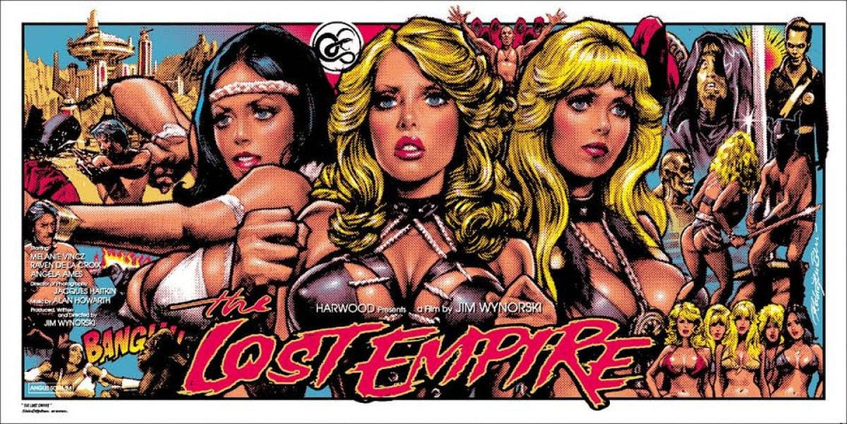
Artist: Rockin’ Jelly Bean
This expansive ode to a forgotten 1984 cheapo by Rockin’ Jelly Bean—a Japanese illustrator with a penchant for doe-eyed, fat-tittied, underground comix inspired pin-ups—is a work that forefronts Mondo’s namesake roots as a raconteur tribute to the infamous Mondo movies of the 70s, a backstory made more curious by being able to name the number of vaguely transgressive Mondo pieces on one hand. I think back to that one vendor with the blue mohawk who traveled to all the cons & festivals manning the Mondo booth thinking “this dude is way too punk to be selling $75 THE LAST JEDI posters” but then I look at this blown out, horned up THE LOST EMPIRE piece and I think “yeah, this is why the blue mohawk guy works here.” The dickhead energy vibrating from the crimsons and golds of this poster are the most powerful in the repertoire, and the wonky 18×36 dimensions have ensured that I’ll never walk into a Michael’s and easily find a frame that can display it.
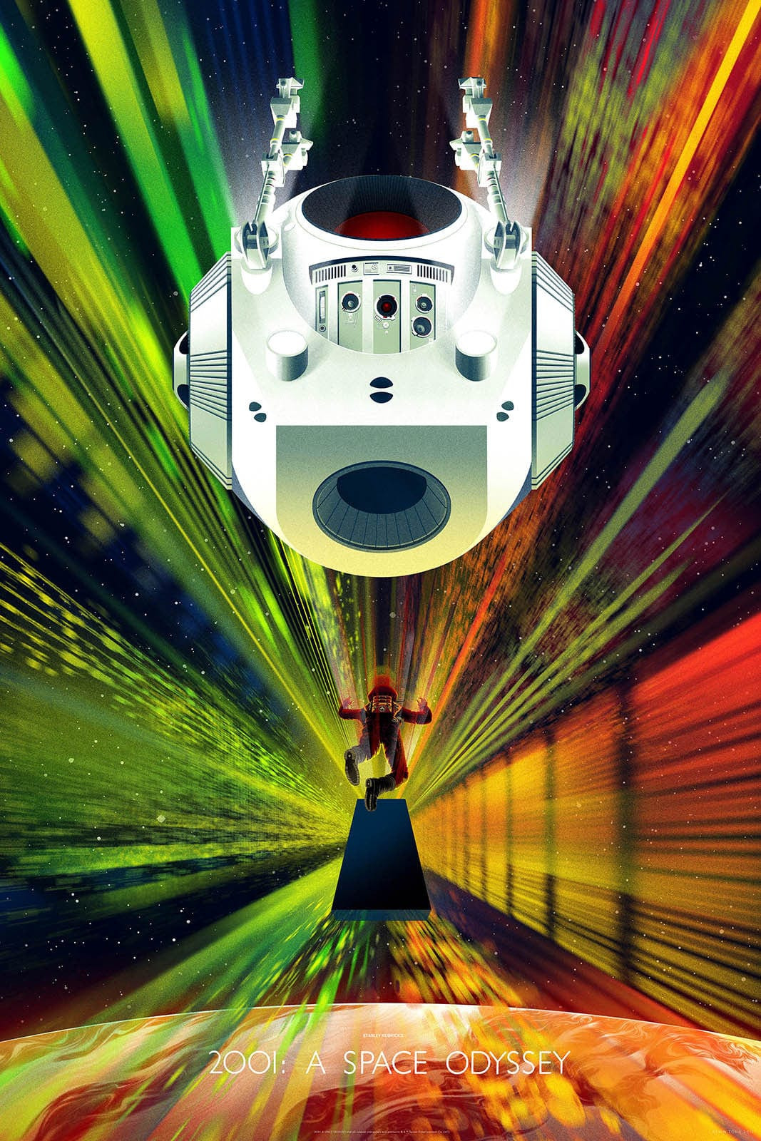
Artist: Kevin Tong
I don’t mean to offend whatsoever, and I really hope Kevin Tong isn’t insulted if he potentially reads this, but his 2001: A SPACE ODYSSEY print is hung up in my bathroom because its multi-planed descent into the galactic vortex is just so beautiful to look into while I’m taking a shit. I just imagine a miniature Keir Dullea spiraling through my bowels and into a serene white tank of transcendence, and suddenly 7:30 AM starts feeling a lot more monolithic.
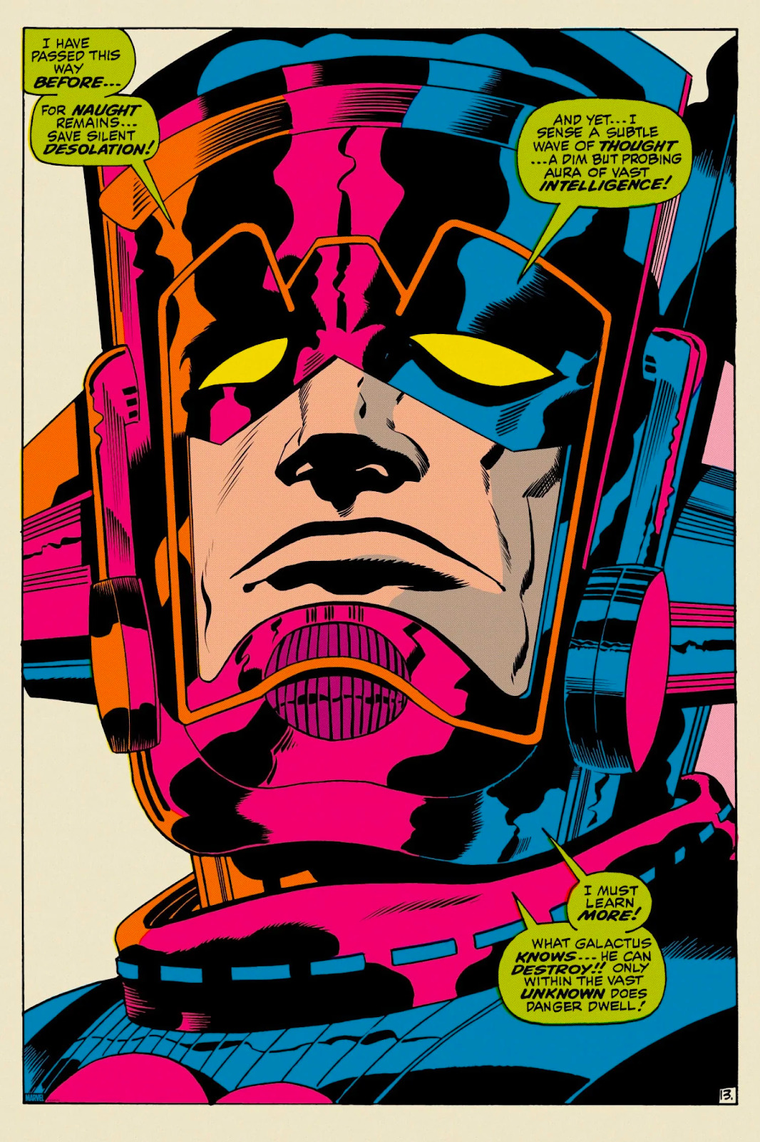
THE MIGHTY THOR #160: “WHAT GALACTUS KNOWS…” POSTER
Artists: Jack Kirby, Vince Colletta
Tragically, this was unknowingly the final Mondo poster I ever purchased. Notably inaugurated with their run of Batman covers, ranging from the Detective Comics days to THE DEATH OF ROBIN, Mondo embarked on this sick trend of blowing up comic panels and turning pulp into wall-dominating decor. I can’t say I’ve ever read a single comic book with Galactus in it, but that hasn’t stopped him (it?) from being one of my favorite obsessions in Marvel. The vacancy in the eyes, mixed with the duty to education as a means of destruction, paints a portrait of an aloof god attempting to find universal worth in his nihilism. Fuck, man, I really miss being a fan of Marvel. That shit used to give you character. Now look at us. Now just… Look at us.
In closing, fuck Funko. In a few years, there’s a solid chance that they will have gutted Mondo so sufficiently that every link in this article will 404 and combust into flames the moment you hover your mouse over them, and for just that possibility, I wish Brain Mariotti and Andrew Perlmutter a very suck my musty dick and balls from the back you dumb fucking baboons. Have fun dumping the rest of your stock in the desert.
2004-2023


Comments